Redesign the Mobile Onboarding of a Value-based Investment App
Company
IWP Capital
June 2022 - Sep 2022
Responsibilities
User Research & Flow
Hi-fi Prototype
Brand Design
Team
1 PM
2 UX Designers
2 Engineers
Context
📋 About Sanctify
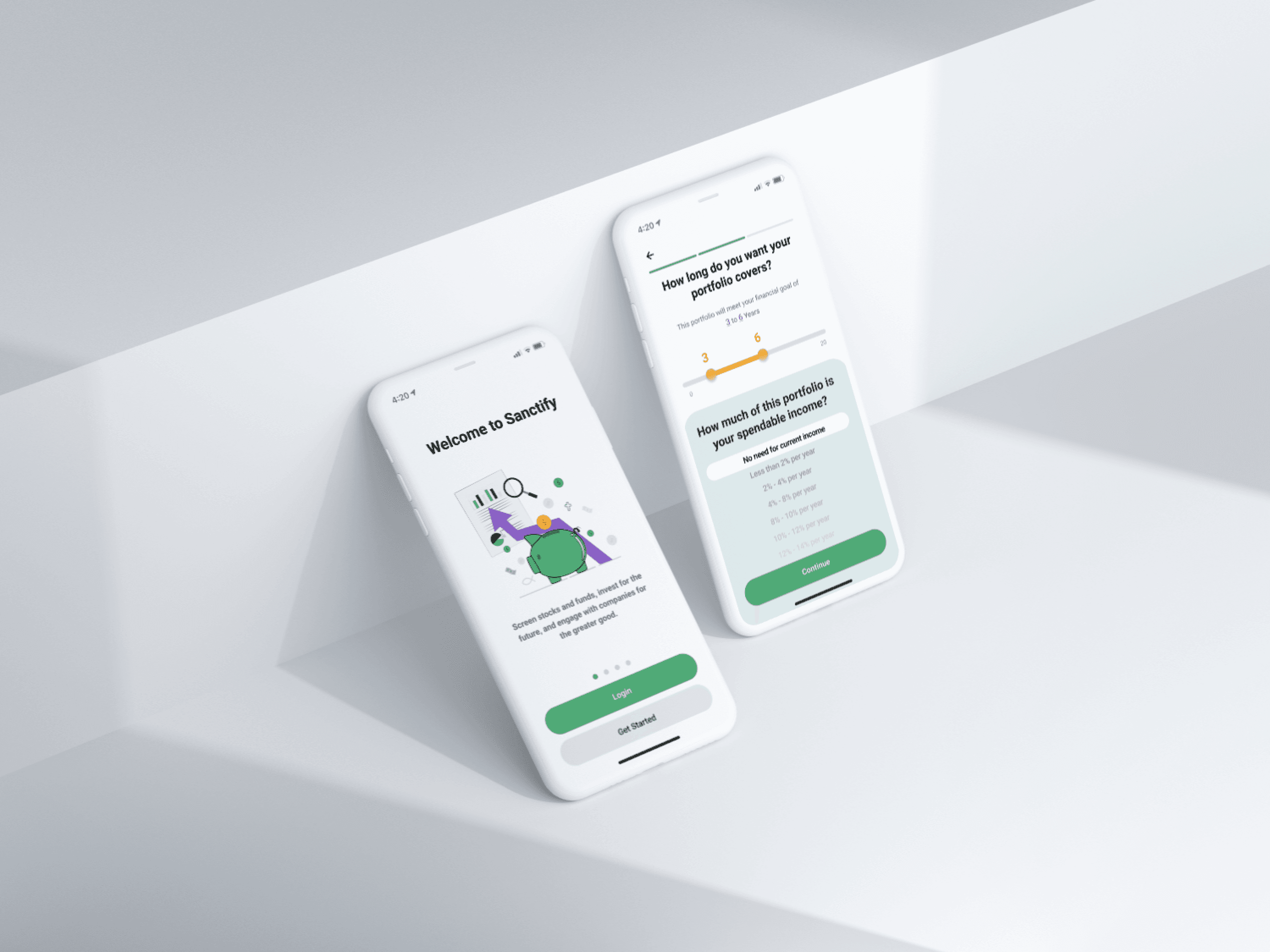
Sanctify is an personal investment app for value-based investors, emphasizing ethical and eco-conscious choices. The app aims to prominently communicate its unique value to foster user growth.
📌 Current Problem
High Drop-off Rate: Sanctify’s current MVP design has a 60% onboarding drop-off rate, signaling a need for new designs.
Sign Up

Successfully Onboard
-60%
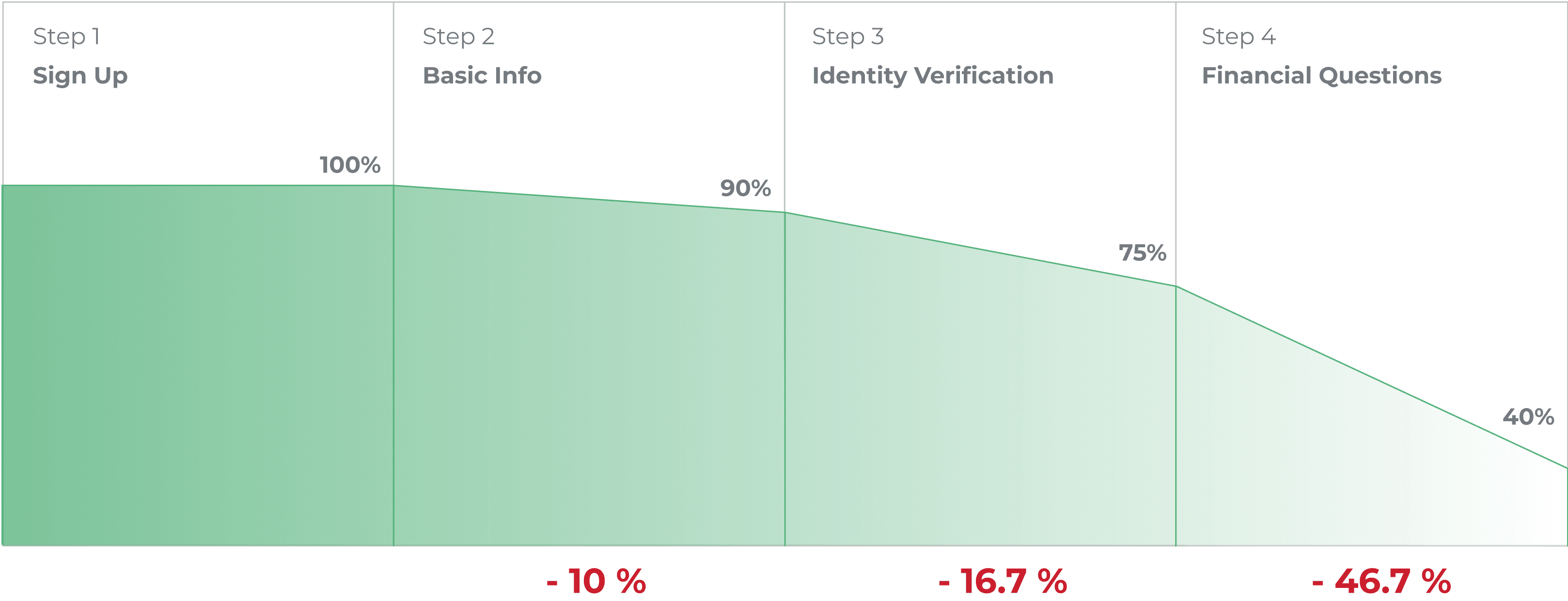
⚡️ The Challenge: How can we help to reduce user churn rates?
Target Users
👤 Who Are The Target Users?
Sanctify targets value-based investors prioritizing ethical investment choices. Additionally, 70% of Sanctify current users have religious belief
70% Affilated
Sanctify Users Religious Affiliation
Affiliated
Unaffiliated
👤 Sanctify targets U.S. investors aged 30-55, influenced by religious beliefs or value-based decisions.
Research
❓Why Our Target Users Drop Out
Reason 1: Lengthy Process

Reason 2: Never-ending information filling
Current MVP App Design

“Filling out this never-ending information is overwhelming, I can't skip any of the questions.”

“I don't like having to answer so many questions before deciding to use the app.”

Reason 3: Product Theme Visually unappealing
Current MVP App Design
Competitor APP Theme Study

Sanctify: Value-based investment 🎯
Outdated Design 🙁
Goal Misalignment 🙁

Robinhood: Democratize finance for all 🎯
Green 📗
People 🧑🤝🧑
Robinhood World 🗺️

Wealthfront: Automated investment services 💻
Highlighted Value 📗
Wisdom Purple 🔮
Objective
📝 The Main Problems Are
Lack of User Engagement
The app's visuals and tools are too generic and fail to connect with target users, particularly as it doesn't show value-based investment.

High Cognitive Load
Users face uncertainty due to the unclear number of steps and lack of progress indicators in the app.

Lengthy Process
The app's process involves too many steps and transitions, leading to a cumbersome user experience.

💡
Design Challenge
How can we design a smooth and attractive onboarding experience that balances the client’s and
users' needs?
Ideate
📋 New User Flow
New!
Warm Landing
Spotlight on Sanctify's investment value
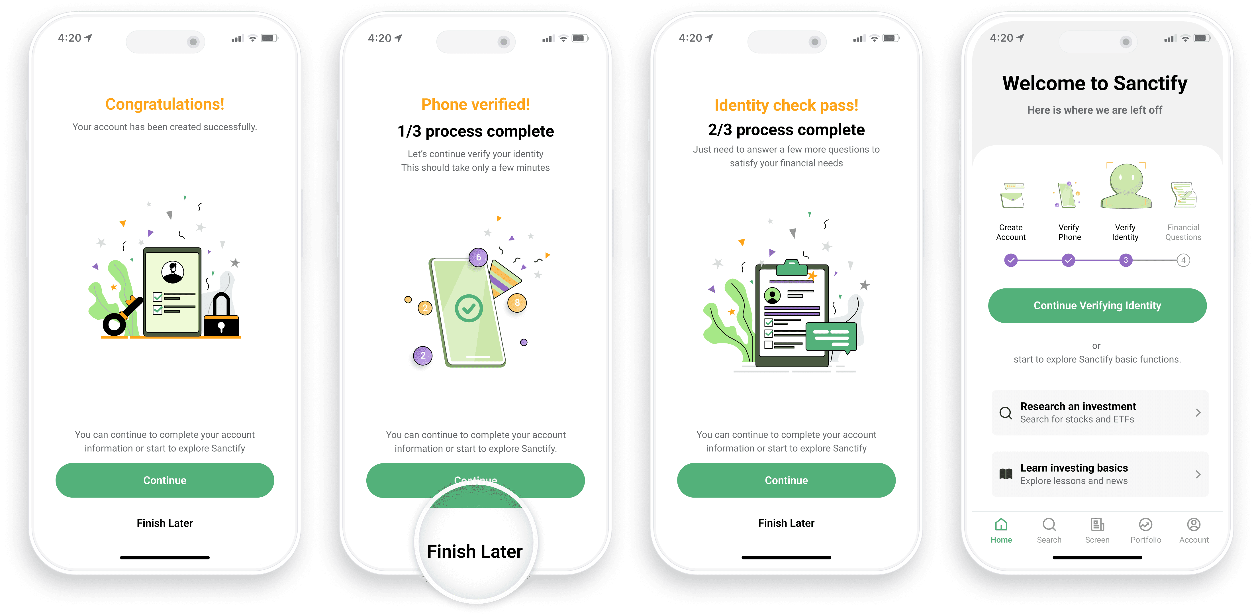
New!
Finish Later Points
Explore the app first and resume anytime
Switch Question Order
Put short required question at first
Categorize Question
Put short required question at first

📋 Takeaways From Competitor Analysis

An successful fintech investment app must have…
Mandatory Registration
Must
Optional Non-essential Questions
w
i
t
Attractive and Aligned Theme
w
w
One Step at a Time
1
n
e
Solution
New Landing Page - Illustrations and Theme Colors Aligned with Value-Based Investment Goal

Tree of Life

Theme Color

Approach - Wireframing & A/B testing
A: Ad auto lay & Click to learn more
B: Auto carousel ads display ✅

Input Selection & Style - design for reasonable input with smooth and engaging experience.
"I always find answering questions boring and lose interest if they're not very engaging。"
— Mike Thompson, Bank Manager, 42
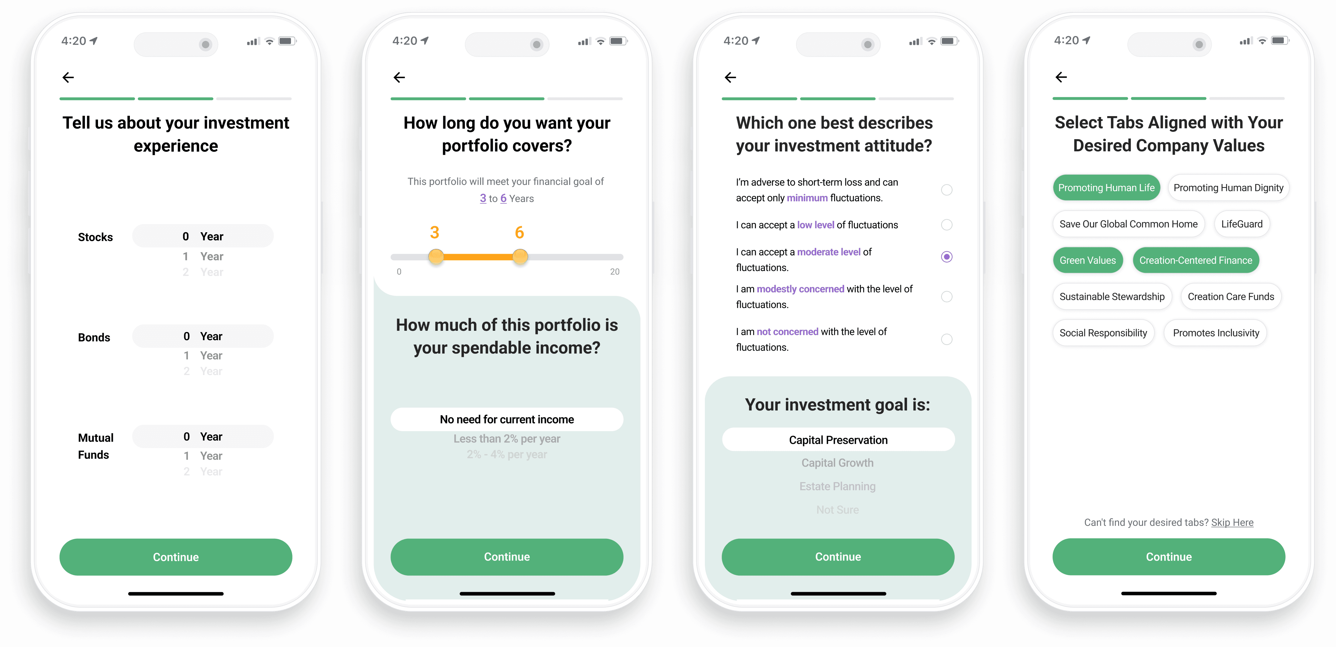
Approach - using HIG and material design system references,
radio button for "only one" choice, pickers for long scrollable list

Finish Later Points Added - Start using the app after basic info registration; resume anytime

Usability testing with 50+ users revealed that 75% prefer a finish later button to explore the app and assess fit with Sanctify.

Balancing user needs with marketing goals, we've enabled optional post-setup questions, allowing users to skip and answer at their convenience after completing basic account setup.

Outcomes

92%
User Onboarding
Success Rate

86%
User Understood Sanctify's Financial Services
30%
Reduction on Drop-off Rate from 60%

Reflection & Takeaways
Balancing the Client and End User Needs
One of the intricate facets of UX design is aligning client desires with user preferences. While clients often seek comprehensive data, users favor simplicity. Navigating this delicate balance, we were able to design an information collection process that adeptly met the needs of both constituencies.
Navigating Collaborative Dynamics
Communications with product manager and engineers help me better understand the balance between user needs and client needs, as well as balance between design and front-end implementation.
Human Attention is Finite: Embracing Values in Design
Creating Sanctify's onboarding emphasized inclusive design. Bridging finance and faith demanded insight into a community valuing human life and eco-friendliness. This project reinforced that design isn't just usability but honoring users' values.
What’s next?
We anticipate the app's launch on the App Store in 2023 (Sanctify App). Once launched, our team will closely monitor drop-off rates and iterate based on both user and client feedback, as well as the data provided pre-launch by the client.
